Google Data Studio in SEO. How to save 40 hours a month?

Google Data Studio is a tool designed to make data analysis and reporting easier, also in SEO. Let me show you how to save 40 hours a month by using Google Data Studio only. First we need to do some calculations. 1 hour is an average time required to draft a report. If you have 20 clients, you obviously need 20 hours to do that, which translates into 2.5 business days.

Assuming that an hour of your work is worth 100 dollar, it’s easy to calculate that this fashion of reporting totals 2,000 dollar a month – so 24,000 dollar yearly – of opportunity costs.
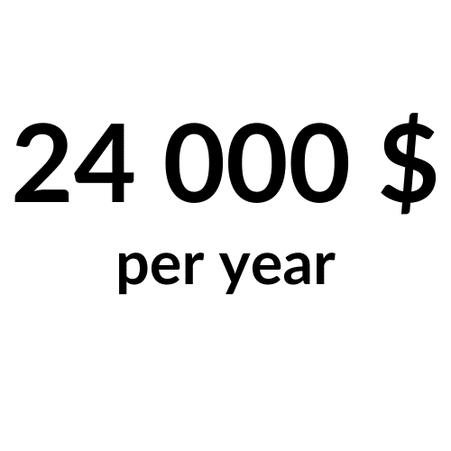
24,000 dollar and 30 days a year are a lot of time and money! You can spend it in so many different ways, don’t you think? For example, you may visit some interesting place or region.

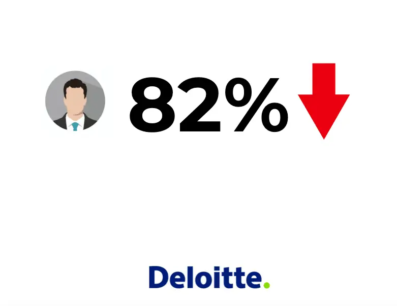
At this point, plenty of people would say: “A report drawn up by a human is of greater value. Besides, the client pays for my time.” I’m a big fan of automation and I believe that both the human and the computer can copy and paste data from Google Analytics or other sources just fine. The point is that the human could spend this time on drawing some conclusions. What’s more, I think that the client doesn’t care who or what prepares a report as long as it answers all the questions asked. Deloitte’s research conducted in Canada shows that 82% of Chief Marketing Officers are unhappy with reports they receive from marketers.
Thus, it’s an area worth exploring and optimizing further, and one of the ways to do that might involve automation using Google Data Studio.
Don’t let them think
The inability to reach the right conclusions by the reader is one of the fundamental reporting problems. A good report ought to present data in accordance with the ‘don’t let them think’ principle, meaning that the reader shouldn’t think too much to arrive at correct conclusions.
A report shouldn’t present all the data, but only researchers’ findings. If it contains information about page loading speed and a low conversion rate, then the reader needs to know that one follows from the other (low page loading speed translates into a low conversion rate).
Data storytelling
Our minds don’t excel in grasping figures and numbers. Data storytelling is simply conveying information to a listener – a reader – by means of a convincing narrative. Data blended with visuals and an adequate narrative can make a report much easier to understand. Let me use the example. You can make others see what you talk about. Compare the following two messages:
Message #1: Your site used to be visited by 50 thousand people; now it’s 100 thousand.
In theory, it’s clear and simple information. In practice, however, most people would find it difficult to grasp. We don’t work with such big numbers on an everyday basis so it’s hard to find a point of reference.
Message #2: Now you’d need Stamford Bridge to have all the visitors to your website in a single place. With our help, you’d need Old Trafford.
As long as a recipient of the message has any understanding of football, it would be much easier for them to visualize it. When you say ‘40 thousand’, you don’t bring any image to the reader’s mind. By referring to a specific place, Stamford Bridge in this case, you create an image. The reader could’ve been to this stadium or at least knows a thing or two about it, hence they’re able to see what’s behind the message. More and more businesses present data in the form of stories. A great example is Spotify which every year provides its users with a story-like summary of their activity on Spotify.

Or Uber:
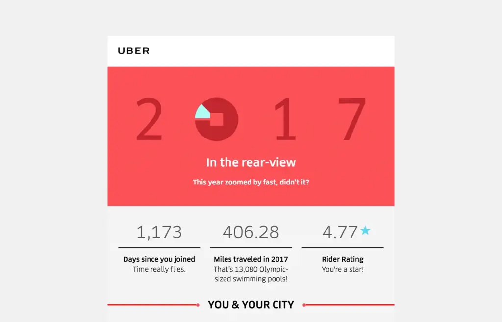
As you can see, Uber translates a number of miles driven into Olympic-sized swimming pools so that its users can visualize the distance covered.
Report purpose & structure
A good report has to answer 3 fundamental questions:
- WHAT?
- WHY?
- WHAT’S NEXT?
Not that long ago in SEO, a table like the one below used to be an SEO standard (I still come across it now and then).
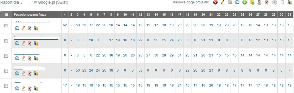
Taking into account all the aforementioned principles, it’s clear that a report in such a form will satisfy no one. Back to the right structure:
- WHAT? A report should present what happened in a clear and concise manner.
- WHY? Everything occurs for a reason; it needs to be touched upon in a report.
- WHAT’S NEXT? A report ought to also tell what needs to be done further, bearing in mind the observations made.
Below is an example of a properly structured message:
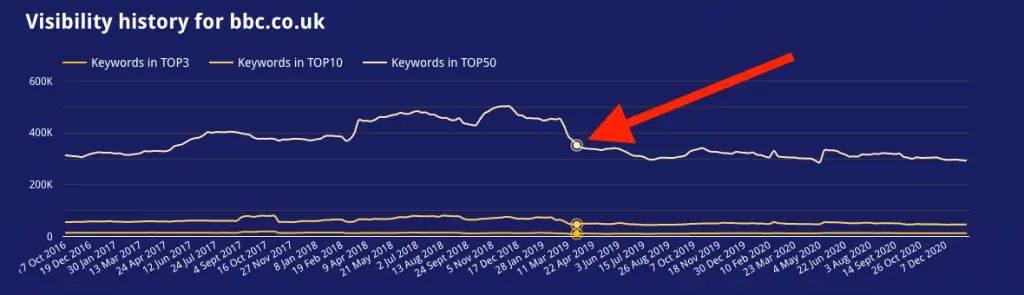
As follows from the chart, on 25 March the site noted a drop in visibility in organic search results. This piece of information by itself means virtually nothing to the reader – that’s why there’s a description beneath the chart: WHAT? A drop in site’s visibility. WHY? The search engine algorithm has been changed. WHAT’S NEXT? A content audit. It’s much easier to understand this way.
Well, if it’s so good, then why it’s so bad?
A typical mistake that plenty of businesses and specialists make involves trying to prove in a report that everything’s great. This fashion of presentation often leads to a conflict. Customers usually deal with numerous issues, don’t look at their business through rose-tinted glasses and the last thing they want to hear is that everything is wonderful. It’s definitely not in 99% of situations. In 99% of situations, it’s possible to tweak and improve something. That’s what a report should revolve around, among other things. Not only should it present what’s fine but should also (and even need to) focus on aspects to improve and on how improving them can affect further efforts. Here’s a simple example: A client hasn’t implemented audit changes when it comes to page loading speed. Even though its site is getting ranked higher and more visible, the problem’s still there and should definitely be mentioned in a report. A message in this case could look like this:
The site’s ranked higher and higher, but it could be even better with increased loading speed. In our audit report that you got from us on [date] we suggested you what needed to be improved in that respect. Additionally, page loading speed affects your site’s conversion rate. According to research conducted by Walmart, a loading time shortened by a second translates into 2% increase of conversion rate. In your case, making your website load quicker by 3 seconds should generate a revenue increase of X dollar.
This way you point out that the site is indeed ranked higher, but you also mention that the performance could be even better, identifying an issue to be resolved.
Google Data Studio – possibilities
You already know how to draw up reports and present data correctly. The time has come for you to learn more about Data Studio, and believe me – there’s a lot to learn.
Connectors
The idea underlying Google Data Studio is to gather information from various sources together and feed them in a digestible form. Data are sourced using connectors; there are over 200 of them available now. And you can design your own connectors too!
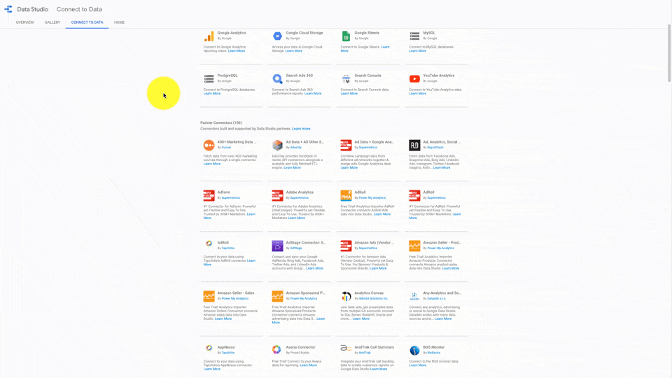
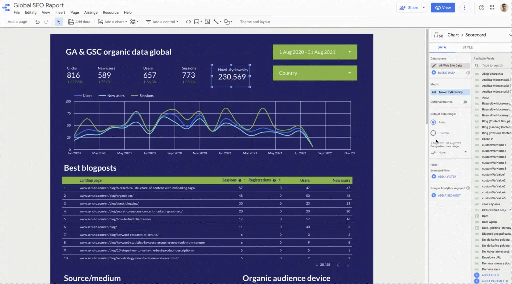
Some popular connectors include Google Analytics, Google Search Console and Google Ads. There are also third-party connector designers, e.g.SuperMetrics. With their integration solutions, you can grab data from e.g. HubSpot and integrate them with Data Studio. There’s also MySql which allows for database enquiries and displays information in Data Studio. This gives you virtually endless possibilities. Below there is a report that I created using available connectors.
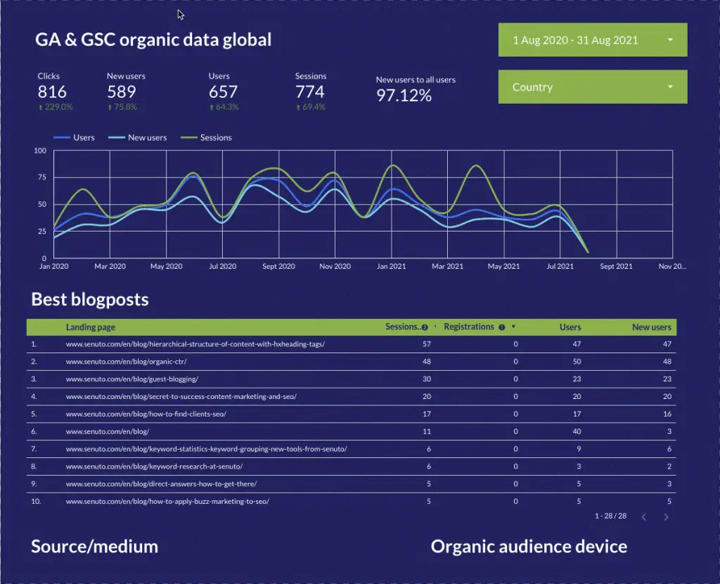
Personally, the connection with Google Analytics helps me follow the performance of our blog. In Data Studio I can apply various filters, e.g. traffic source. My dashboard in Data Studio consists of 22 pages overall; it gives me an overview of marketing and customer service aspects of our business as well as facilitates app development.
Community-driven components
Thanks to a large Google Data Studio community you can also enjoy ready-to-use components which help present data in non-standard ways.
Data combination
One of the unique capabilities of Data Studio is combination of data originating from various sources. Example: I want to compare the number of TOP10 keywords for two different websites on a single chart. To do that, first I just need to add two information sources and then combine them with a metric.
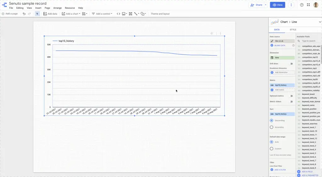
I could also combine data from different Google Analytics accounts to get an overview of traffic of various sites in a single place.
Your own metrics
Data Studio allows to create one’s own metrics as well, with basically endless possibilities. Example: I want to calculate a ratio of new website users to all the website users.
This option allows you to use regular expressions and the case() function in order to, for instance, group pieces of content dynamically. Below you can see my metric that dynamically groups modules in the Senuto app (Senuto has 4 core modules).
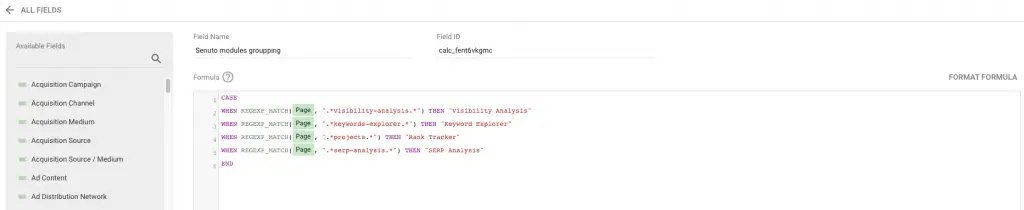
What you see above means “if a site includes a string of characters reading
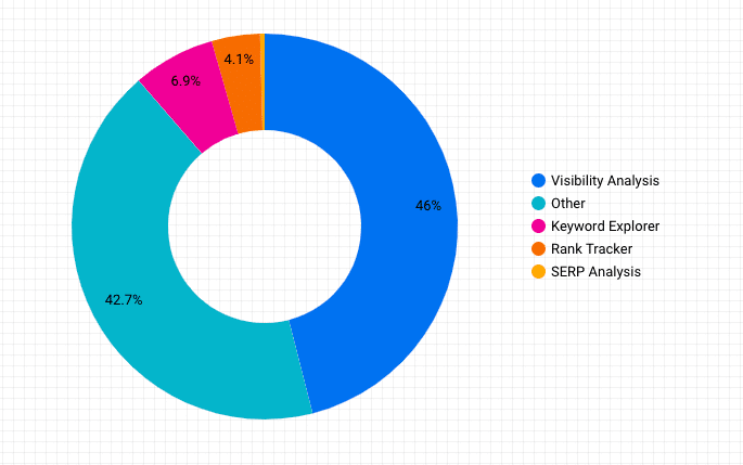
I created a pie chart for a particular range of dates which revealed that 43.1% of the users visited Visibility Analysis, 1.2% of the users visited Keyword Explorer, 4.7% of the users visited Rank Tracker and 2.2 of the users visited SERP Analysis The case() function has plenty of uses. For example, you may design a dynamic conversion funnel and visualize it in Data Studio.
Automation
At the beginning of this article, I brought up saving time with Google Data Studio. Automated reporting is something that definitely helps to save time. When you have a report template that’s clear and comprehensible for both you and your client, you don’t need to send each and every report manually. You can just schedule it and let Data Studio handle this for you.
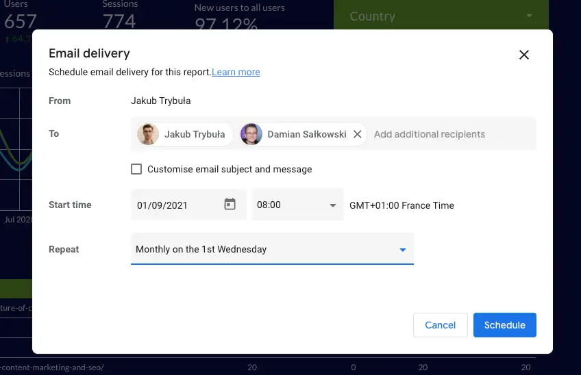
Having such settings, a flat-pdf report will be sent to specific email addresses monthly, every first day of the month.
Senuto Connector
At Senuto we strive to make our data broadly available. To this end, we designed our own connector which helps download data from Senuto. Connector works with the following modules:
- Visibility Analysis
- Rank Tracker
It supports more than 200 metrics and allows for SEO reporting automation. You can learn more about how to use Connector in our Knowledge Base.
Free Google Data Studio templates from Senuto
We also developed a few templates that you may find useful in your day-to-day operations. How to use the template To use a template, you need your own data sources, e.g. plugged-in Senuto Connector. When you don’t know how to create a data source, visit our Knowledge Base. Once you’ve created it, open a template and select Copy&Paste. If everything goes well, the copied report should feature data from new sources, just like on the example. Senuto templates This template allows to obtain information from Visibility Analysis and Rank Tracker. Updates take place every 12 hours. Here is the template: https://senu.to/gdstemplate The Internet is full of sites that offer paid or free templates. Below are two examples.
Give Senuto a Try Start your free trial
What SEO experts have to say about the Senuto connector with Google Data Studio?
Lukasz Kacprzak, Chief SEO Officer, CS Group
Time – Automation – Transparency I use the Google Data Studio integration primarily for reporting on internal organization projects. I sit down in front of my laptop, open a single panel where I can analyze collated data from Senuto (total visibility), traffic information from Google Analytics and Google Search Console. All data collected in the form of charts and tables. Dear SEOs – this is a great convenience. In theory it’s not a big deal, but when we’re talking about analyzing dozens of projects, it turns out to be a huge time saver. I wouldn’t be me if I didn’t mention my favorite part – the ability to automate and email weekly or monthly reports with summary data. When working on client projects, we use the Senuto API for reporting, so we already have reports ready inside the systems. When it comes to internal projects, I would need to involve people from the reporting department and IT to create the summary. With the Senuto integration with GDS, I did it myself. Of course, all this can be done by involving your people. The question is whether we have the time to do it if it has already been automated and is transparent in its simplicity. Some people have time for handicrafts – I don’t have it and I consciously optimize it. I like to travel and that is what I spend my excess time on.
Kamil Sroka, Head of SEO, DevaGroup
Preparing SEO reports involves determining the visibility of the website. Monitoring key phrases will not give us a broad view of our global activities for the domain. To honestly verify the status of a domain, the effectiveness of our actions or the current condition of the website, we have to verify the visibility in the TOP 3, 10 and 50 in Google. In the SEO industry, the ability to use tools and build solutions is a highly desirable trait that is strongly valued in any SEO team. SEO specialists like to pursue jobs that they enjoy and let’s agree – crafting monthly reports is not one of them. Thanks to the Google Data Studio integration and Senuto API we save a lot of time when preparing reports, verifying results or presenting changes to our clients. I definitely recommend automation in the daily life of any SEO specialist or team.
Wojtek Gradzki, SEO specialist & co-founder at Samoseo
We build reports in Google Data Studio due to its attractive form of presentation and the possibility of automatic integration of data from various sources. One of the sources we take into account is information about the visibility of our clients’ websites in Google according to Senuto. As we try to automate our work wherever possible (this way the time of our specialists is used for data analysis and not for data collection), we were very happy to hear about the Senuto integration with GDS. We have been using it from the very beginning. Now not only the time needed for reporting has been greatly reduced, but also the reports are visually consistent and more attractive to customers. Last but not least, the risk of errors, which cannot be eliminated 100% with ‘manual’ reports, has been significantly reduced.
Sebastian Heymann, Head of SEO at EACTIVE
We use Senuto integration with Google Data Studio primarily to report SEO results to our clients. Thanks to this, the TOP3 / TOP10 visibility charts fit perfectly into the overall style of our reports. In our GDS reports we include information about current positions of specific keywords which we have worked on intensively at a given time. Also, we often take into account data concerning seasonality of a given industry.

Damian Salkowski
CEO Senuto. Specjalista SEO z bagażem doświadczeń z rynku polskiego i rynków zagranicznych. Autor dwóch książek o marketingu internetowym i kilkuset artykułów w tej tematyce. Prywatnie fan piłki nożnej i sportów motorowych.
All articles →