Ecommerce UI Design: The Anatomy of a Conversion-Focused Product Page

Creating a product page that convinces people to buy your product is tough, especially when you’re up against over 26 million other stores. Plus, with more than 70% of shoppers ditching their carts before buying, the pressure’s even tougher.
So, what’s the secret to designing an ecommerce product page that turns browsers into buyers?
In this guide, we’ll explore the anatomy of conversion-focused product pages, breaking down the must-haves and the must-dos to help you clinch the sale.
Whether you’re giving an old page a facelift or starting from scratch, we’ve got the tips that will help you make a real impact.
Personalized Delivery Estimates
Whenever you’re shopping online, what’s one of the first questions you ask when you find something you love? “When will it get here?”
That’s where personalized delivery estimates come into play. They answer this burning question upfront, making shoppers more likely to hit “buy” by removing the uncertainty of waiting times. It’s how you create a transparent and trust-building experience.
How to Implement This UI Element
-
Ensure your estimates are as accurate as possible. Use real-time data considering stock availability, the customer’s location, and your shipping partners’ timelines.
-
Use the shopper’s browsing location or allow them to enter a zip code to personalize the estimate.
-
Place the delivery estimate prominently on the product page. It should be impossible to miss.
-
Use clear, easy-to-understand language and graphics. A countdown or a calendar view can make the information more digestible.
Now, here’s how to bring this to life on your site:
-
Start by integrating your website with your logistics database to pull in real-time shipping data.
-
Then, design a simple UI element that requests the user’s location, either automatically or manually, to provide personalized estimates.
-
Remember, the goal is to make this feature both informative and unobtrusive.
Example
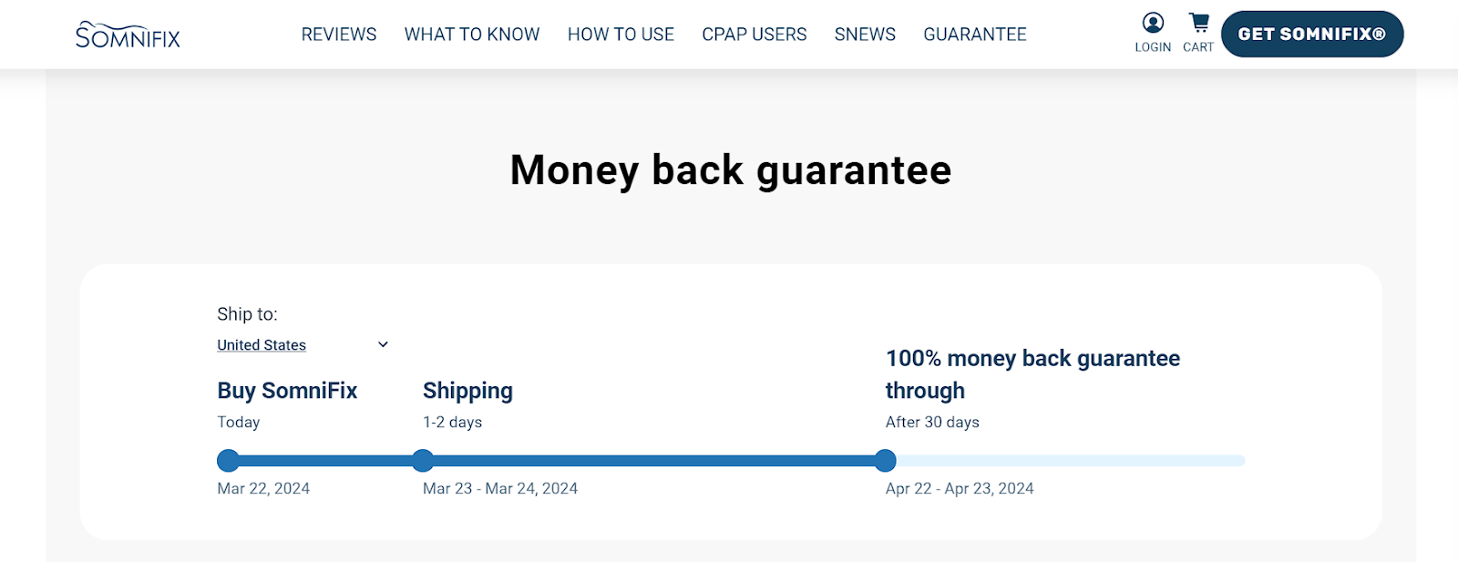
Let’s see how this works from the lens of a real brand – SomniFix, a brand known for its innovative mouth strips for better sleep. On their product page for SomniFix Mouth Strips, they’ve incorporated an interactive delivery estimate that’s visually engaging.
Unlike many others, they don’t wait until the checkout process to surprise you with delivery times. This graphical, easy-to-understand format right on the product page significantly lowers conversion friction. It’s a fantastic example of how making delivery times clear and interactive can ease the customer’s journey from browsing to buying.
 Source: somnifix.com
Implementing personalized delivery estimates like SomniFix can bridge the gap between customer hesitation and conversion. This strategy is well worth investing in for any ecommerce site aiming to boost their sales.
Always-Visible Conversion CTAs
When customers are scrolling through your product page, filled with specs, testimonials, and FAQs, they might find that magic moment when they’re ready to buy. If at that instant the “Add to Cart” button is out of sight, you risk losing a sale.
Studies show that adding simple, text-based CTAs can increase conversion rates by up to 120%. You can even amplify that rate by making your CTAs always visible. That way, you’ll ensure that the moment a buyer decides to purchase, they can act on that impulse without scrolling up or down to find the way to do so.
How to Implement This UI Element
-
Implement a sticky CTA that remains visible as the user scrolls. This can be at the top, bottom, or sides of the screen.
-
Your CTA should stand out with a contrasting color and clear message like “Buy Now” or “Add to Cart.”
-
Ensure your sticky CTA adapts well to different screen sizes, especially on mobile devices where screen real estate is limited.
-
Keep the sticky element minimal so as not to overwhelm or distract from the content.
To make this possible on your site:
-
Use front-end web development involving CSS and JavaScript. Most website builders have plugins or settings that allow for the creation of sticky elements.
-
Ensure the CTA is coded to remain in the viewport as the user scrolls.
-
Also, test its functionality across different devices for a seamless shopping experience.
Example
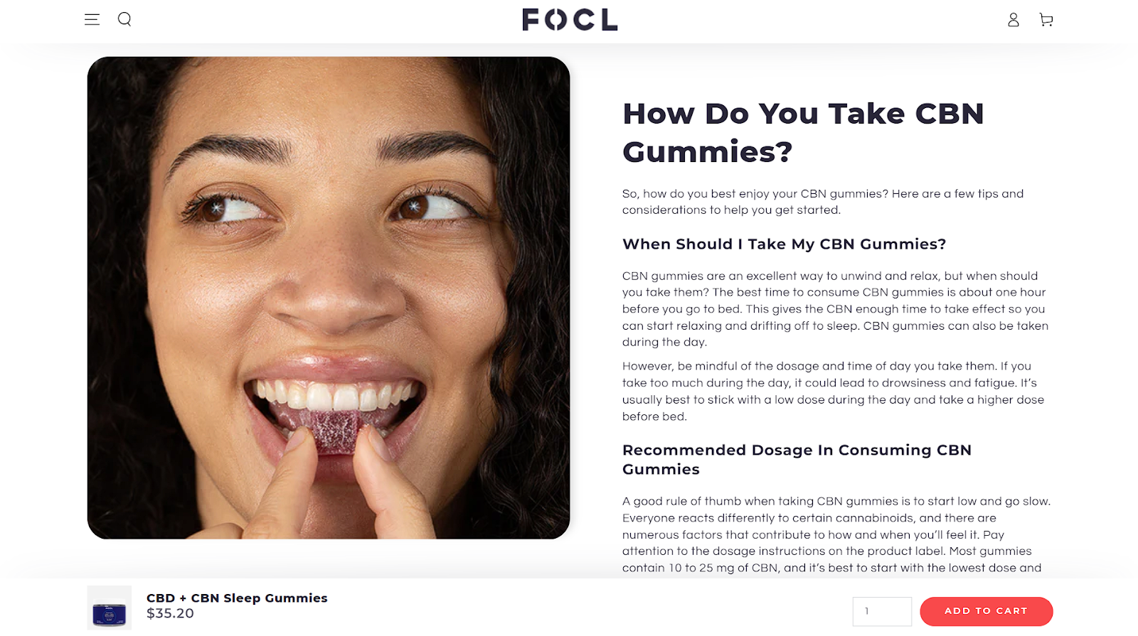
FOCL, selling plant-based wellness solutions, exemplifies this tactic flawlessly on their CBD + CBN Sleep Gummies product page.
Recognizing that their comprehensive product details could potentially overwhelm or distract visitors, they implemented a sticky CTA button. This constant, unobtrusive reminder serves as a gentle nudge for visitors to take action, significantly reducing buyer hesitation.
 Source: focl.com
FOCL’s approach underscores the importance of a user-friendly UI element that respects the visitor’s informational journey while strategically encouraging conversion. It proves that adopting an always-visible CTA can effectively minimize friction and propel hesitant visitors toward making a purchase.
Trust Badges
When it comes to online shopping, earning customer trust is key to clinching sales. One UI element that can greatly assist in this area is trust badges.
These badges are visual cues that signal to shoppers your site is trustworthy and secure, essential in an era where concerns about privacy, quality, and authenticity run high. One survey discovered that about 49% of online shoppers don’t complete their purchases, stating lack of trust as the main reason.
Trust badges cover a range of assurances – from security certifications to product quality seals. They’re not just decorative – they’re a direct communication line that says, “You’re safe here.” When customers feel secure, they’re more likely to make a purchase.
How to Implement This UI Element
-
Choose badges that resonate with your audience’s specific concerns. For a health supplements site, badges certifying product safety and ingredient quality are more persuasive than, say, a generic SSL certificate badge, which would work better on a finance service site.
-
Display badges where they’re most visible – near important conversion points like the product description, price, and checkout button.
-
Too many badges can overwhelm or confuse. Select a few that truly matter to your audience.
-
Ensure all badges are current, especially those that need renewals (like security certifications, for example).
Here’s how to get your trust badges to work on your site:
-
Integrating trust badges involves selecting the appropriate ones from third-party services or creating your own for unique selling points (like “Made in the USA”).
-
Next, strategically place these badges on your product pages, either through direct coding or using your ecommerce platform’s tools.
Example
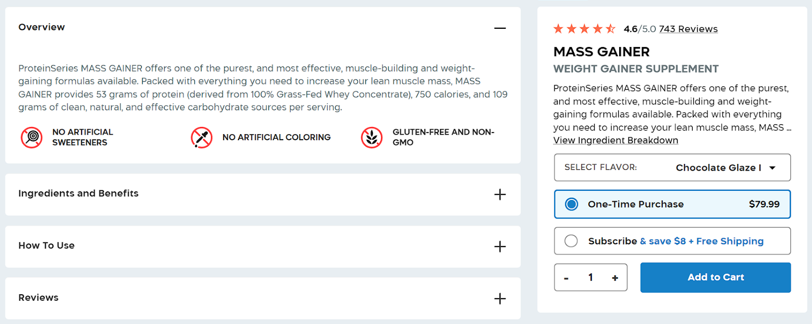
Transparent Labs, a natural sports nutrition supplement brand, offers a great example of implementing trust badges. For example, if you look at this product page, badges like “3rd-Party Lab Tested,” “No Artificial Sweeteners, Fillers, or Dyes,” and “Gluten-Free and Non-GMO” are prominently displayed.
They understand their audience’s concerns and directly address them with relevant, reassuring badges.
 Source: transparentlabs.com
 Source: transparentlabs.com
This approach builds trust while aligning perfectly with the brand ethos of transparency and quality.
By adopting trust badges as Transparent Labs has, you communicate your commitment to quality and security, significantly boosting customer confidence and encouraging purchase decisions.
High-Touch Sales Triggers
In an era where digital transactions dominate, the human touch remains irreplaceable, especially for products or services that require a significant investment or come with a complex set of options.
High-touch sales triggers are essential here because they offer a level of personalization and reassurance that automated systems can’t match. They signal to potential customers that help is readily available should they need it, making the purchasing process feel safer and more guided.
For certain product types and target audiences, the option to connect directly with a human can be the difference between hesitation and conversion.
How to Implement This UI Element
-
Place high-touch triggers, such as “Chat with an Expert” or “Schedule a Call” buttons, in prominent positions on your product pages, especially near the main CTA.
-
Make it clear what kind of support the customer can expect. Will they be chatting with a knowledgeable product specialist or scheduling a consultation?
-
Ensure that initiating contact requires minimal steps. A simple form or a one-click initiation can greatly increase the likelihood of engagement.
-
Seamlessly integrate these triggers into your site’s overall design. They should feel like a natural part of the shopping experience, not an afterthought.
Example
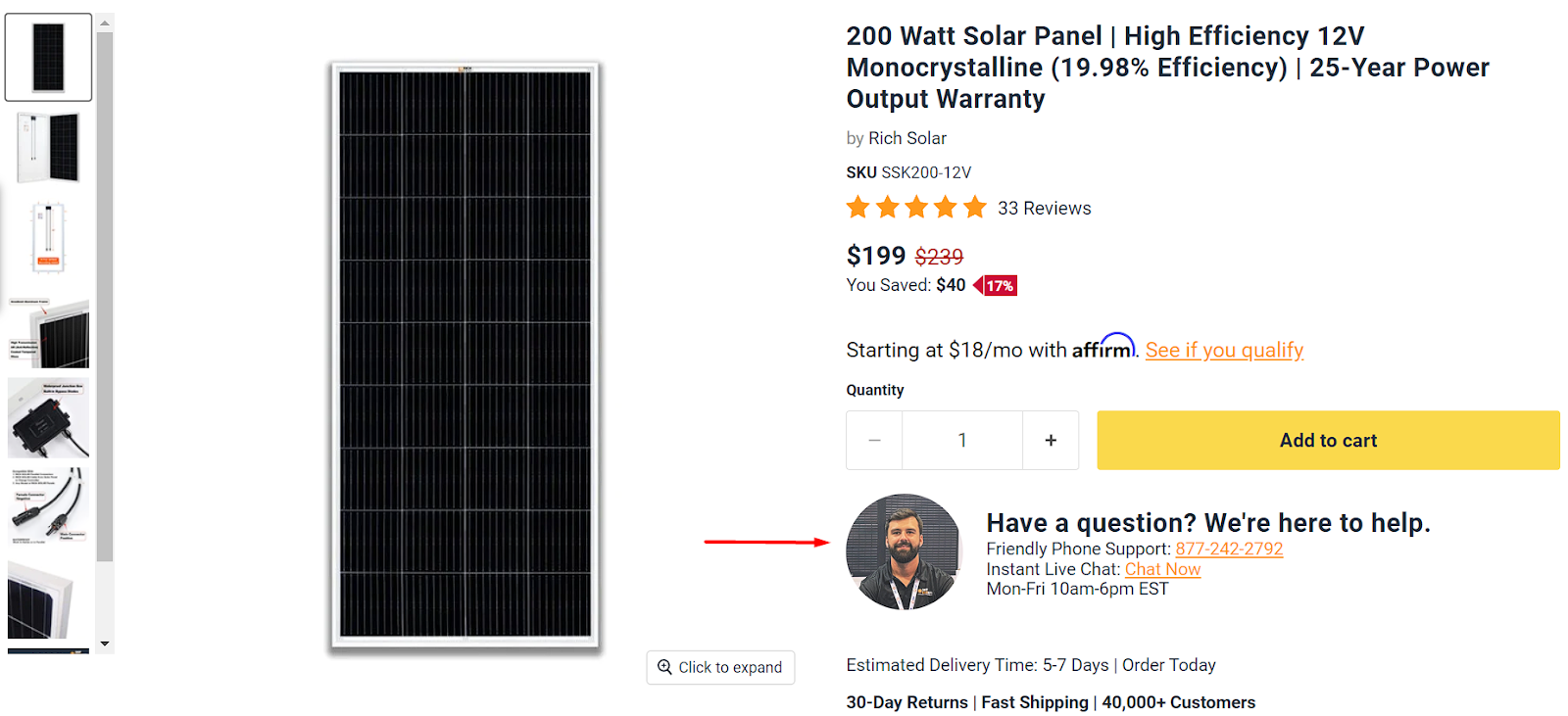
ShopSolar, a leading company in the solar power systems market, demonstrates how to implement high-touch sales triggers. On their 200 Watt Solar Panel product page, just below the main CTA, they’ve placed a clear, inviting option for customers to connect with an expert.
This UI element is brilliantly designed, making it immediately obvious to shoppers that personalized assistance is just a click away.
 Source: shopsolarkits.com
By adopting this approach, ShopSolar enhances the user experience and addresses potential questions or concerns in real time, guiding customers through the buying process with a personal touch. This strategy significantly reduces the friction associated with complex purchases, demonstrating the powerful impact of integrating high-touch sales triggers into your ecommerce strategy.
Product Videos
With engagement rates soaring higher for video content than for static images or text, incorporating videos into your product pages can significantly enhance the shopping experience.
Videos offer a rich, immersive experience, allowing customers to see your product in action and envision it in their own lives. They can convey a vast amount of information in a short time, appealing to today’s consumers who prefer quick and engaging ways to assess products.
Moreover, videos can boost conversion rates by providing a clearer, more engaging representation of your products than photos or descriptions alone ever could.
How to Implement This UI Element
-
Prioritize high-quality, professionally shot videos that reflect your brand’s standards. Poor quality can detract from the product’s appeal.
-
Tailor the video content to match your product’s strengths and your audience’s interests. Highlight key features, benefits, and use cases.
-
Embed videos prominently on your product pages, ideally near the top, where they can catch visitors’ attention early on.
-
Optimize videos for quick loading and make them easily playable across all devices to avoid user frustration.
-
Track engagement metrics for your videos and use this data to refine and improve your video strategy over time.
Example
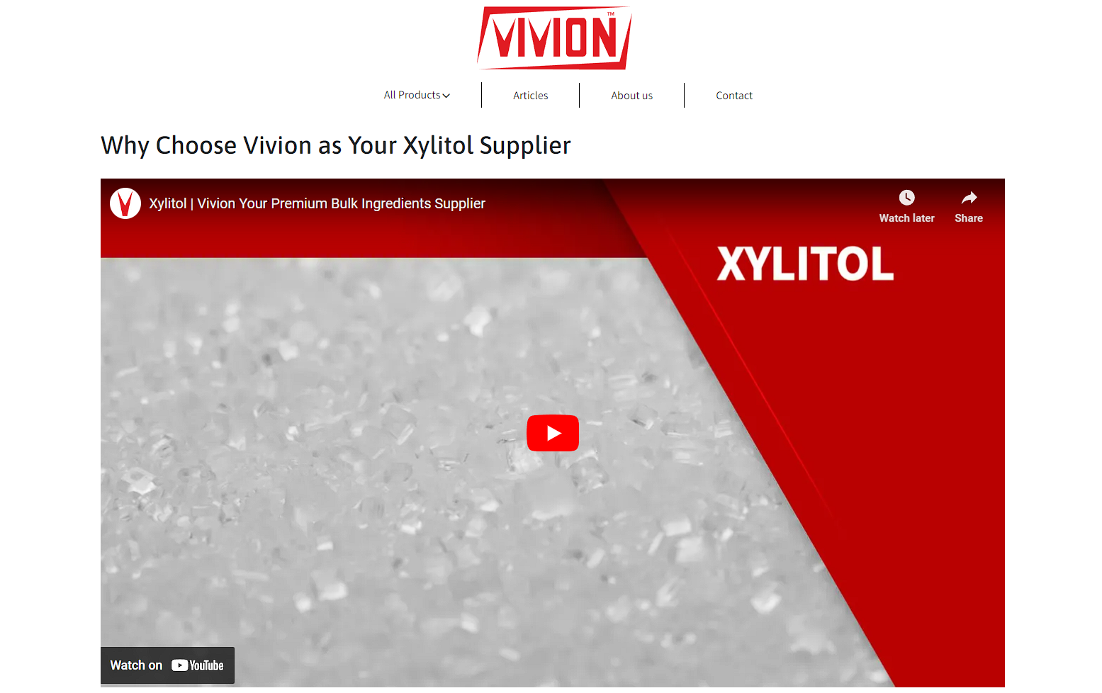
Vivion, an ingredients supplier, showcases the effectiveness of long-form product videos on its wholesale xylitol page.
Their comprehensive video dives deep into the product’s benefits and value proposition, catering to an audience keen on understanding the full scope of what they’re buying.
 Source: vivion.com
This approach helps demystify the product and reinforces Vivion’s authority and reliability in the ingredients supply sector.
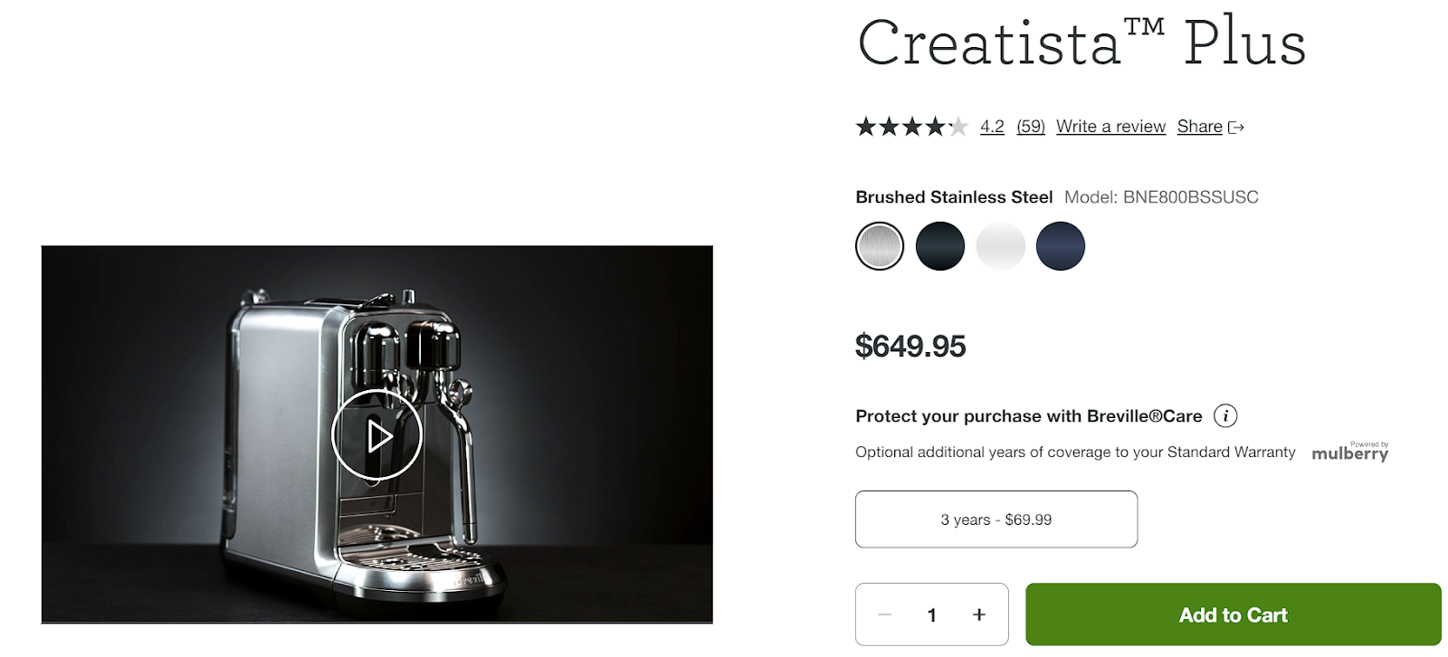
Another example is Breville, a high-end kitchen appliances brand. They take a different but equally effective approach with their Creatista Plus Coffee Machine product page.
They employ shorter videos that focus more on the aesthetic appeal and the quality of the coffee the machine can produce.
 Screenshot of a product video on a product page
These videos brilliantly highlight the product’s sleek design and the exquisite coffee it crafts, appealing directly to the sensory experiences the brand’s customers crave.
Complementary Products
As an important UI element, this feature serves a dual purpose: it helps users find what they need by presenting alternatives and ensures they remain within your ecosystem rather than seeking options elsewhere.
Introducing similar products keeps the decision-making process fluid and dynamic. It acknowledges that not every visitor will find exactly what they’re looking for on the first try and provides them with a curated selection of alternatives.
This is a key tactic in retaining visitors and potentially increasing conversion rates, as it caters to the varied preferences and needs of your audience. It helps enhance the shopping experience while significantly reducing the bounce rate by keeping visitors engaged and interested.
How to Implement This UI Element
-
Ensure the similar products displayed are relevant to the item being viewed. This involves smart categorization and tagging of your inventory.
-
Position the similar products section in a place where visitors are likely to look after reviewing the product details, such as near the bottom of the product page or in a sidebar.
-
While offering alternatives is beneficial, too many options can overwhelm shoppers. Aim for a sweet spot of around 4-6 similar products.
-
Accompany each recommendation with a clear, high-quality image to quickly convey what the product is.
-
Including reviews and ratings within the similar products section can provide additional persuasion and build trust.
Example
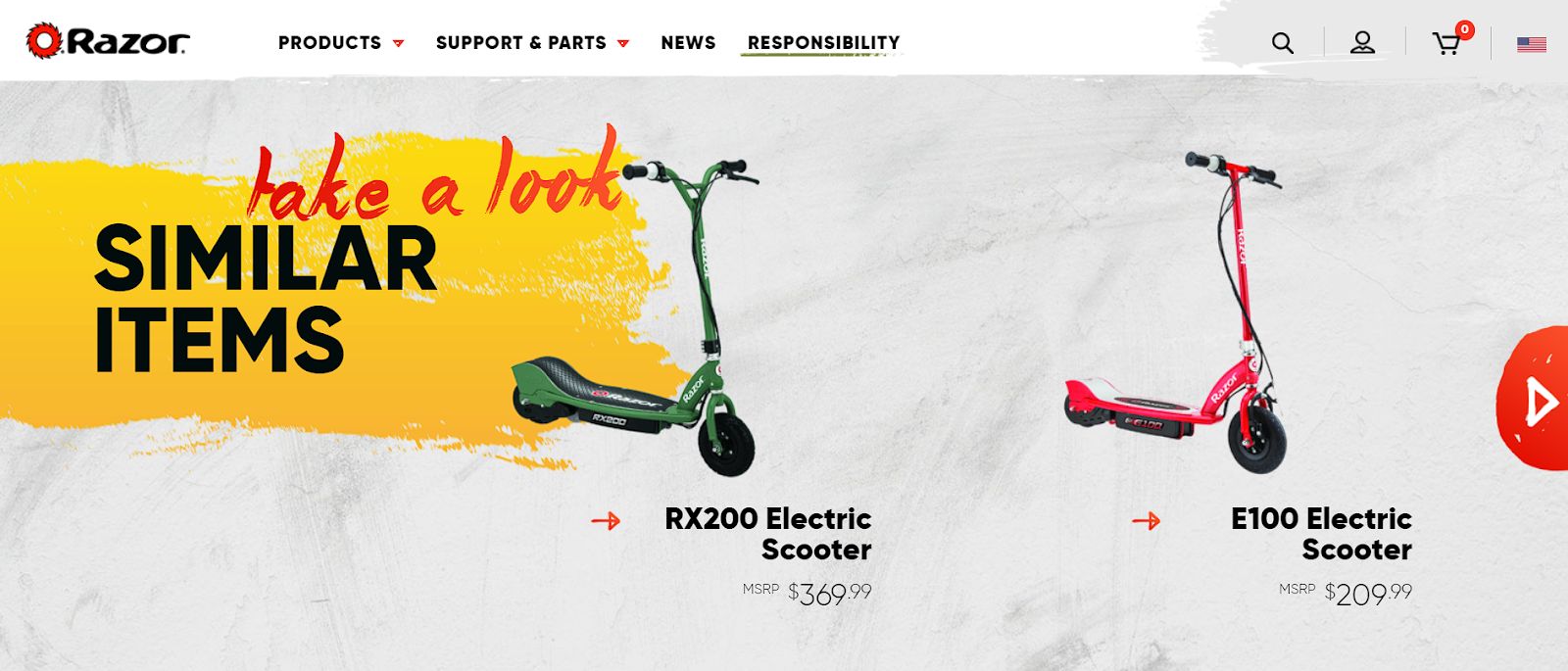
Razor, renowned for its electric scooters, bicycles, and personal transporters, masterfully employs this tactic on its C25 Electric Scooter product page.
By featuring a “Similar Items” section, Razor offers visitors alternatives without the need to leave the page or, worse, the site. This keeps the shopping experience seamless and significantly enhances the likelihood of retaining conversions.
 Source: razor.com
Razor’s approach exemplifies how well-curated recommendations can complement the product discovery journey, keeping potential customers engaged and increasing the odds of a sale.
Product Options and Variants
Providing multiple versions of the same product directly on your product pages is a powerful strategy for catering to diverse customer preferences without overwhelming them with choices.
Giving customers the ability to choose from various options and variants of the same product acknowledges the uniqueness of each shopper’s preferences and requirements. It simplifies their decision-making process, making it easier for them to select the product that best fits their needs, all without leaving the page or engaging in a boring search for alternatives.
This approach streamlines the shopping experience while significantly amplifying the potential for conversion by accommodating different tastes, sizes, and needs within a single, easily navigable interface.
How to Implement This UI Element
-
Ensure the UI for selecting options is intuitive and straightforward. Dropdown menus, color swatches, and size selectors are popular and effective choices.
-
Clearly display the differences between options, including price differences, availability, and any other pertinent information.
-
Update the product image and details according to the selected variant to provide visual confirmation of the choice.
-
Integrate the options feature with your inventory system to accurately reflect availability and prevent frustration due to out-of-stock variants.
Example
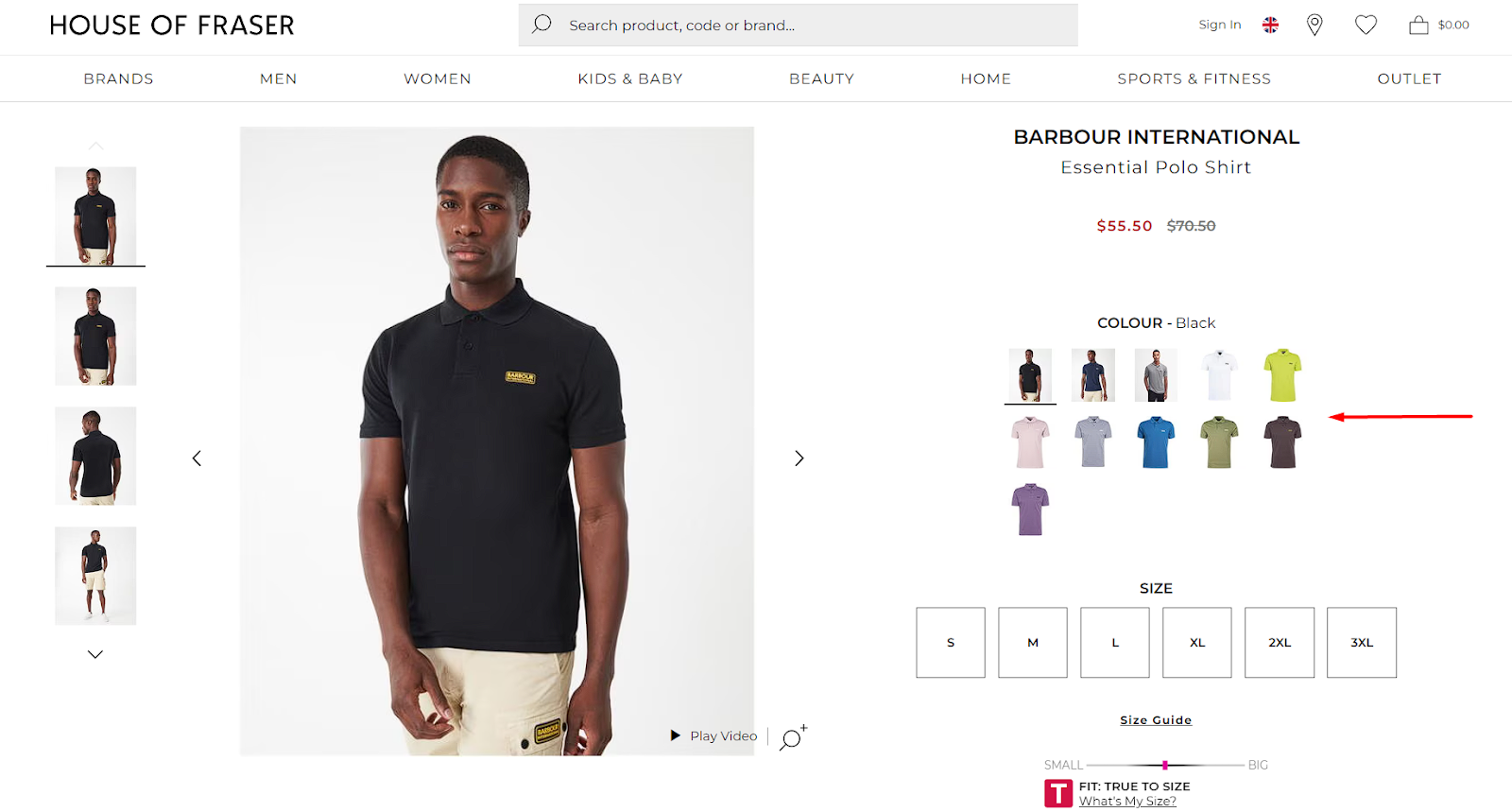
House of Fraser, a renowned clothing brand, exemplifies the effective implementation of this tactic on their Barbour International Essential Polo Shirt product page.
Allowing visitors to choose from over ten variations of the same product (ranging from colors to sizes) significantly enhances the user experience and conversion potential.
 Source: houseoffraser.co.uk
This smart approach eliminates the need for multiple product pages per variant, simplifying the customer’s journey. The above method shows how offering a broad spectrum of choices on a single product page can lead to higher satisfaction and, ultimately, more conversions.
Final Thoughts
The tactics we’ve discussed above are your arsenal in the ongoing battle for the consumer’s attention and loyalty.
Implementing them will allow you to set your brand apart from the competition, creating memorable shopping experiences and, ultimately, converting visitors into devoted customers.
Dive into your website analytics, gather your team, and start experimenting with these proven tactics. Make your product pages a showcase of your commitment to excellence and customer satisfaction.

John Hurley
John Hurley is a professional geek. He loves overdelivering to his mostly SaaS & e-commerce digital marketing clients. And romantic comedies are his not-so-guilty pleasure.
All articles →