Mobile-First Index - optimize your site for mobile devices!

At the end of March 2018, Google on its official blog announced the gradual migration of sites to the mobile index. This means thatorganic search results will be unified over time across all devices based on the Mobile-First Index. Thus, it is becoming increasingly popular to create sites tailored to mobile devices first, and only later scale them to the PC version.
It is worth knowing how to optimize a site for mobile devices. Such procedures result in lightweight, fast and intuitive websites in line with Google’s recommendations and the new approach, the Mobile-First index.
How to optimize a website for mobile devices? Here are Google’s official recommendations:
.
1. Avoid mobile versions under separate address m.witryna.pl
.
It is recommended to use responsive websites (Responsive Web Design), i.e. websites that change their layout and width of elements according to the resolution of the device they are viewed on. It also makes it easier to make changes to the site later on, as there is only one version to edit.
2. Structured data and metadata should be visible on both versions of the site
.
Having structured data is extremely important - by placing appropriate tags next to pieces of content, Schema.org directly influences Google robots’ learning. This helps them better understand the content of the page and gather information about the web. With this data, they are able to display relevant items in search results, such as addresses, prices, reviews or opening hours.
3. Make sure that rel=canonical and rel=alternate have been applied correctly
.
This will make it easier for Google robots to find the canonical pages and the correct language versions on different devices. This will also avoid the occurrence of duplication on the site.
It’s also a good idea to use rel=“next” and rel=“prev” attributes so that pagination pages are treated as a logical sequence. This explains to the robots that each subsequent page is a continuation of the content on the previous page.
4. Make_sure_that_your_website_loads_fast
.
Fast-loading sites definitely perform better in rankings. The longer your site takes to load, the faster the chance that a user will eventually give up browsing.
According to a study conducted by Kissmetrics.com, as many as 47% of people expect a site to load in less than 2 seconds, and 40% will abandon a visit if it takes longer than 3 seconds.
Page loading speed can be easily verified using Google Page Speed Insights. The PageSpeed score ranges from 0 to 100 points. The higher the score, the better. A score of at least 85 points means that the site is performing well.
 Source: https://developers.google.com/search/mobile-sites/mobile-first-indexing.
Free tools for optimizing websites for Mobile-First Index
.
Owners of sites that focus on attracting desktop users, of course, do not have to worry particularly for now. Mobile-First Index activities, however, were not invented by Google for the sake of making our lives more difficult. On the contrary, they are meant to improve the User Experience of Internet users, and that’s exactly how they should be treated. We do not need any fancy and expensive tools to help us optimize the site. We can make use of free developer tools from Google:.
-
Mobile optimization test
.
The Mobile Optimization Test tool allows you to check each sub-page for Mobile-First Index. You’ll find out whether the site is tailored for mobile devices, and if there are any problems or blocked resources, you’ll be informed in a clear list:
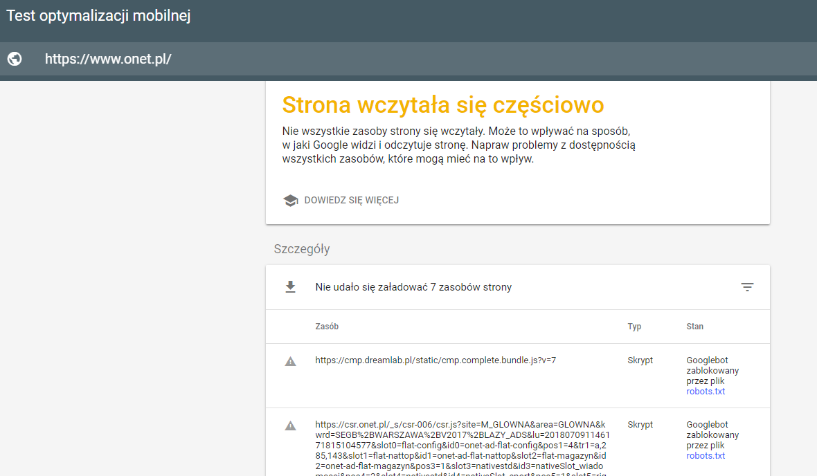 Mobile optimization test.
-
Tools for Web Developers in Chrome
.
The Web Developers Tool in Chrome is one of my favorite tools that I use every day for various types of tasks. In the Chrome browser, all you have to do is press the shortcut Ctr+Shift+I, in the site you’re checking out to get to the Web Developers Tool.
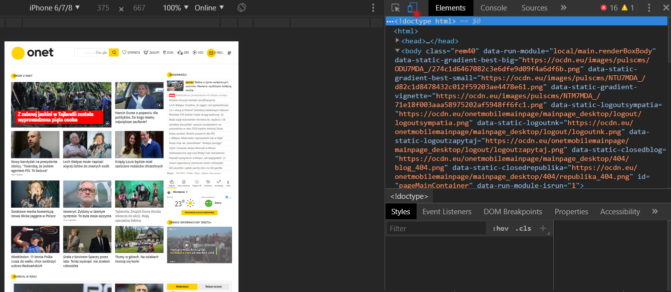
By clicking on the red highlighted icon, we go to the appearance of the site on any mobile device. We can choose the resolution, as well as the device model. So you don’t need to click through sub-pages on your phone to verify the correct display of elements.
In addition, thanks to the possible interference with the source code (of course, without actually affecting the site, it happens only in preview) we can verify individual elements, move them, delete them or add new ones.
-
Google Search Console
.
At the beginning of the development of each site, it is a good idea to access the Google Search Console. Under the search traffic tab, we have support available on mobile devices. GSC is able to “spit out” a comprehensive report regarding all indexed elements that may affect the perception and feel of users. Below is a view of a sample report of the site’s ease of use issues:
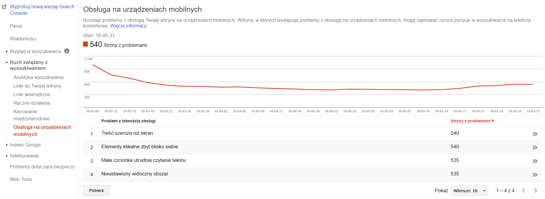
Based on the above information, you can easily find problematic site resources that somehow hinder the user experience on mobile devices, and then fix them.
-
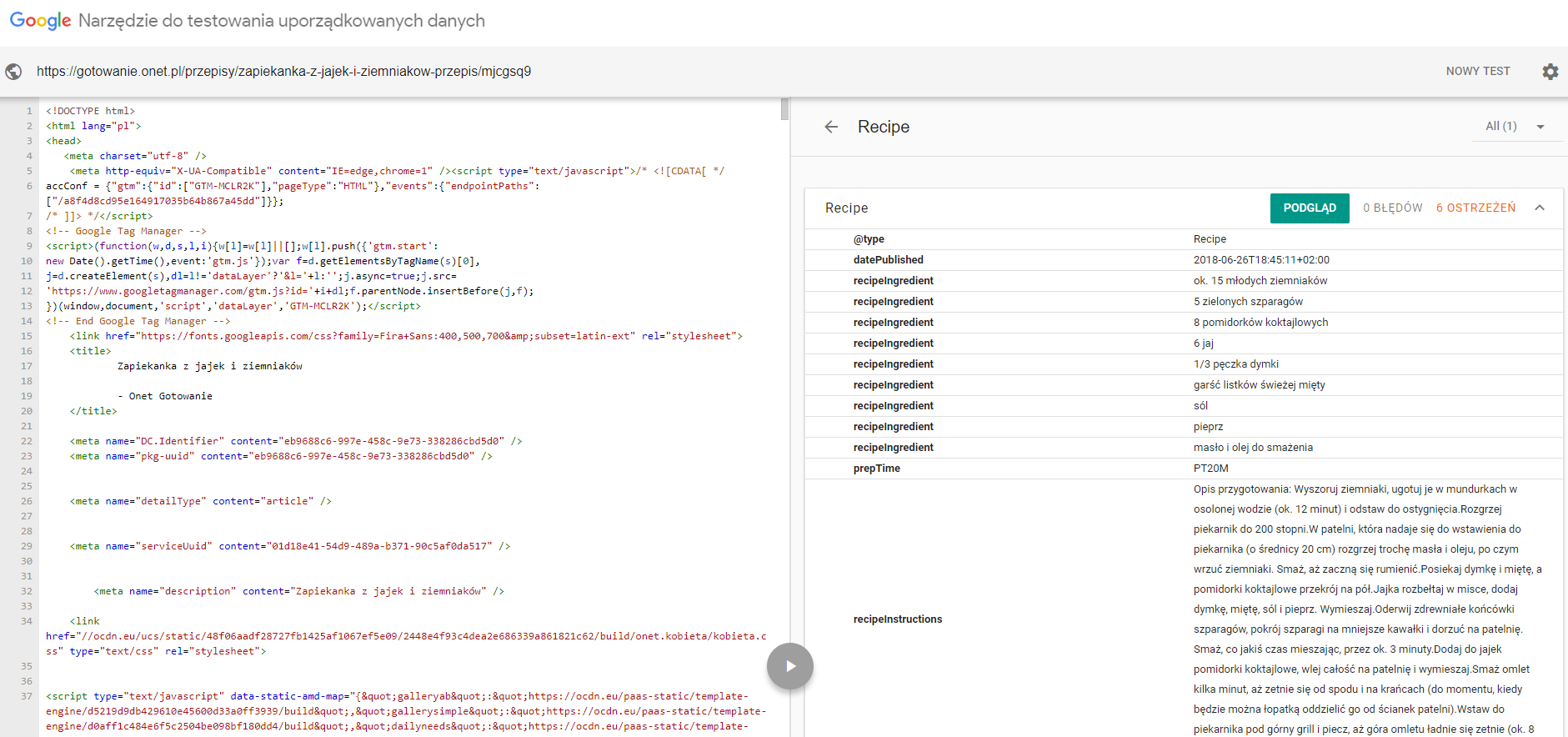
Testing structured data
.
As I pointed out earlier, structured data is an important element to implement correctly. Of course, they must be the same for the desktop and mobile versions. Google does not disappoint in this regard either, and provides another simple structured data testing tool. All you have to do is provide the URL of the site and a snippet of code to verify.
How to optimize a website for mobile devices? Summary
You already know how to approach the topic of optimizing your site according to the Mobile-First Index. Consider also that algorithms are regularly updated.
All the information you get now are suggestions to optimize your sites for mobile users. No one quite knows whether in the future, or even in the near future, they won’t become major ranking factors, and Mobile-First won’t even be a requirement to display high in organic search results.

Joanna Pierzynka
Specjalistka SEO w Andrew Lucas London oraz Key Studios. Specjalizuje się w optymalizacji technicznej i analizie danych. Prywatnie fanka elektroniki, gier komputerowych oraz paintballa. W wolnym czasie rozkręca i naprawia urządzenia elektroniczne lub streamuje swoje postępy w grach.
All articles →