How to optimize images for web?
Uploading graphics and images in the proper size and right quality has always been an important aspect related to website functionality, but it has become even more important since web developers, SEO specialists, and websites’ owners have paid more attention to website performance. So let’s take a look at how to optimize the graphics and images you add to your website in such a way as to preserve the value that this visual aspect brings.
Image optimization… let’s not use them at all*
*If you are a developer, designer, owner or SEO specialist, you know that such a solution is generally not an option. Visual space, graphics, video and images carry too much value – they add dynamics to the site, allow you to get to know better what the site carries in its content, whether it’s a news site, e-commerce site, software house site, handicrafts, dance school or any other type of a website.
TL;DR
Below, in a few bullet points, is a summary of what you can do to optimize web graphics and images:
Choose the right file format
The file format of graphics has a huge impact on quality and file size. Therefore, it is worth choosing formats that provide good quality with the smallest file size, such as WebP, JPEG 2000 or JPG XR.
Reduce file size
Therefore, it is worth using image compression tools available in the browser, in the desktop version, plug-ins (Websites based on WordPress or CMS platforms), ready made scripts and libraries. Some drag and drop and WYSIWYG builders have built-in compression functionality. Some web hosts offer similar functionality in the hosting management panel.
Optimize images for faster loading times
Image optimization is a critical factor that impacts the speed of website. To speed up website loading, techniques such as lossless and lossy compression, image resizing before uploading, selecting the appropriate file format, and hosting images on a fast server or in the cloud should be utilized. Lossless compression maintains image quality but reduces file size without losing data, while lossy compression reduces quality but can achieve even smaller file sizes.
Tips for choosing image file
When choosing the appropriate image file size, several factors need to be considered, including the size of the image displayed on the website, the type of file format, image quality, and Internet connection speed. To achieve optimal results, file size should be chosen that minimizes the size without losing quality. When selecting file formats, both quality and file size should be considered. File formats such as JPEG and WebP are popular on the internet due to their good quality and small file size.
Recommended image optimization tools
There are various tools and resources available for image optimization, including TinyPNG, or ImageOptim for compressing images. Image editing software such as Adobe Photoshop or GIMP allows for modification and scaling of images to achieve optimal results. Additionally, browser extensions such as Optimole or WP Smush automatically optimize images during website loading.
If you want to explore the topic of optimizing images and graphics, use the broader description of each point.
Choose the right file format – popular web image formats JPG, PNG, SVG, GIF
When it comes to optimizing images, file format is one of the crucial aspects. For a long time, the most common web graphic formats were JPG and PNG:
JPG
**JPG (Joint Photographic Group) or JPEG (Joint Photographic Expert Group)**commonly jay-peg – the default format for digital images.The lossy file compression used in JPG reduces file size, but the higher the compression, the lower the quality.
PNG
PNG (Portable Network Graphics) is a lossless file format, which means that it preserves all the original data in the image, resulting in high quality images. It supports transparency, making it a good choice for images with transparent backgrounds or overlays. PNG files are often used for graphics, logos, and other images that require high detail and a transparent background. The main disadvantage of PNG files is that they can result in larger file sizes than other image formats.
A typical practice when adding images to a website, especially for people who do not do web development on a daily basis, is to add very large PNG files in places where it is completely inapplicable. As a result, there is no value from using this format, there is, instead, a negative impact on performance and loading time (especially when, within, for example, one article, several such images are added).
SVG
SVG **(Scalable Vector Graphics)**is a vector image format. Unlike raster images, which are made up of pixels and can become blurry or pixelated when scaled up or down, SVG images are based on mathematical equations and can be scaled to any size without losing quality. At the same time, this is mainly applicable to simple graphics and shapes.
GIF
GIF (Graphics Interchange Format) is another popular image format for the web. One of the main advantages of GIF files is their ability to support simple animations. However, GIF files have not been so widely adopted. Their drawback is that GIFs have a limit in the number of colors used and are relatively large files.
Choose the right file format – next-gen image formats: WebP, JPEG 2000, JPEG XR, AVIF
Like everything related to technology, graphic formats are also evolving, and new-generation high-performance photo formats are emerging that are gradually replacing the most commonly used ones to date. Below are the information on the next-gen formats used.
JPEG 2000
JPEG 2000 is a newer version of the JPEG format that uses wavelet compression to achieve better image quality with smaller file sizes. It supports lossy and lossless compression, as well as transparency and a wide range of color depths. JPEG 2000 is popular in some industries, but it is not widely supported by web browsers.
JPEG XR
JPEG XR (previously known as HD Photo or Windows Media Photo) is an image format developed by Microsoft. It uses a compression algorithm that is similar to JPEG 2000, but it is designed to be more efficient and faster. JPEG XR supports a wide range of color depths, as well as transparency and lossless compression. However, it is not widely supported by web browsers too.
AVIF
AVIF (AV1 Image File Format) is a new image format based on the AV1 video codec. It is designed to be smaller and more efficient than other image formats, while maintaining high image quality. AVIF supports both lossy and lossless compression, as well as transparency and a wide range of color depths. However, like the previously described formats, it is not yet widely supported by web browsers.
And the last but not least
WebP
It was left to the end for a reason, because in the following section we will describe how to use these formats, and it is WebP that will appear most often due to its popularity.
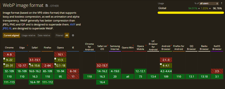
WebP is a modern image format that was introduced by Google in 2010. It was designed to reduce the size of images on the web while maintaining the same quality as other popular image formats such as PNG and JPEG. One of the main advantages of WebP is its superior compression, which can result in significantly smaller file sizes compared to other formats. This means that websites can load images faster, which can improve the user experience and reduce bandwidth costs. Additionally, WebP supports transparency and animation, which makes it a versatile choice for web graphics. WebP is becoming increasingly popular and is supported by most modern browsers, making it a promising option for web designers and developers.
The growing popularity of the WebP format means that it is supported by a growing number of browsers, making it the most versatile of the next-gen formats included in our list.
WebP also has one of the best quality to file weight ratios. This can be seen in the table below. The table shows examples of file sizes depending on the format used. At this point, however, it is worth noting that:
- GIF is rarely used for graphics without animation
- File size can vary depending on various factors, such as image content and compression level.
| | |
Format |
Example File Size for 1080×1080 Image |
| | |
JPG |
100 KB |
| | |
PNG |
500 KB |
| | |
GIF |
150 KB |
| | |
WebP |
70 KB |
| | |
JPEG 2000 |
90 KB |
| | |
JPEG XR |
80 KB |
| | |
AVIF |
50 KB |
As you can see, WebP is the file with almost the least weight. On the other hand, notice how much more a PNG file weighs. Now imagine that you use 10 PNG-formatted graphics in your post, and for that you use these images in huge resolutions. It’s easy to imagine by how much the page load changes. As for the resolutions, you can read more about it in the next paragraphs, but first, let’s take a look on how to change image file formats.
Another, more detailed example you will find in WebP Compression Study
Which next-gen image format to choose?
So can one and only one next-gen image format be chosen (One Ring to rule them all, One Ring to find them, One Ring to bring themLOTR… :D). If one were to think about it, WebP seems to be the most optimal solution, but it will not be universal for absolutely every case (less useful for viewing images offline), so it is worth deciding for your own purposes.
How to change image file formats
There are few ways to compress images:
- You can export graphics in a specific format in popular graphics programs such as GIMP or Adobe Photoshop
- You can use popular web tools such as Convertio or Zamzar
The above solutions are great if you want to upload, or edit from one to several graphics. However, what if there are, say, 10,576 of them?
Don’t worry, fortunately you don’t have to do it manually????
- You can use ready-made command-line tools / libraries such as cwebp
- Some hosting providers also provide conversion tools in their panels. For example, WP Engine and Cloudwaysuse cwebp
- If your site is based on CMS WordPress, you can do this using plugins such as Imagify, Webp Converter, Smush, and many others
What to pay attention to when changing the format of image files?
It would be too wonderful if conversion had only advantages and no risks. Here’s what to consider when pursuing these optimizations:
- Remember that still not all browsers and not every client will be able to support webp, so be sure to use an HTML tag called srcset. If a particular browser does not support the WebP format, an alternative format will be served
- Consider what exactly the graphics available on your site are to be used for. For example, if you want users to download it and use it in their documents, using AVIF or WebP format will not be optimal because it will force recompression on the end user’s part
How to resize images for optimal viewing?
Resizing images for optimal viewing is another important aspect of image optimization for websites. Images that are too large can significantly slow down website performance (as shown in the table above) and lead to a poor user experience. On the other hand, images that are too small can appear blurry and pixelated, which can also negatively impact user experience, especially when there is something necessary within the specific image and without this information, next step of an action in impossible to achieve. Therefore, it’s essential to resize images correctly to ensure optimal viewing for website visitors.
The ways to resize files are similar to those described about changing the format, only the specific solutions we can choose from differ, although some tools will be universal. For example, the WPMUDEV Smush plug-in will take care of resizing and formatting for us. For resizing, we can rely on automation or set parameters such as the minimum size to which files can be reduced. Similarly, you will also find web tools, such as ResizePixel.
You can use popular command-line tool as well. One of them is ImageMagick.
What to pay attention to when resising images?
- First of all, analyze whether you are resizing globally for the entire site or for individual sections within the site. Next, pay attention to whether the resizing will make the content unreadable, as a too-small or too-large photo will crash the layout.
- When resizing images, it’s essential to keep in mind the aspect ratio. The aspect ratio is the proportion of the width to the height of an image. Resizing images without maintaining the aspect ratio can lead to distorted and stretched images. Therefore, it’s crucial to maintain the aspect ratio while resizing images to ensure optimal viewing.
- Similar to file format optimization, you can use responsive images, srcset tag and additionally using parameters such as source media, or sizes.

Kacper Grebski
SEO Specialist at DevaGroup where he is involved in Search Engine and Searcher's Experience Optimization. He enjoys issues related to technical on-site optimisation. Privately, he plays instruments and dances Popping.
All articles →